The Customer Relationship Management (CRM) platform that the call-centre team used was dated, consisting of several different software applications which greatly increased the time consumed in retrieving information. Moreover, the support team is spilt in two - one part for billing or payment enquiries and the other for operations. These teams used two separate systems which made it difficult for them to support each other when one team is busier than the other. The aim of this project was to bring all the data onto one application that can be used by both the billing and customer service team.
Client: Keytree
Tools: Adobe Illustrator, Photoshop and Zeplin
Severn Trent had previously engaged a different agency who were not able deliver a suitable solution, so the expectation from us was high. The project specification was spilt between two phases; when a solid, workable solution was provided for Phase 1, we would then win the pitch to continue on to Phase 2 to deliver a full working platform. We adopted an agile methodology with the majority of the team based on-site in Coventry.
My role as the sole UI designer was to undertake the high-fidelity design, based on user research and wireframes from the UX team and work with feedback from stakeholders and end-users.
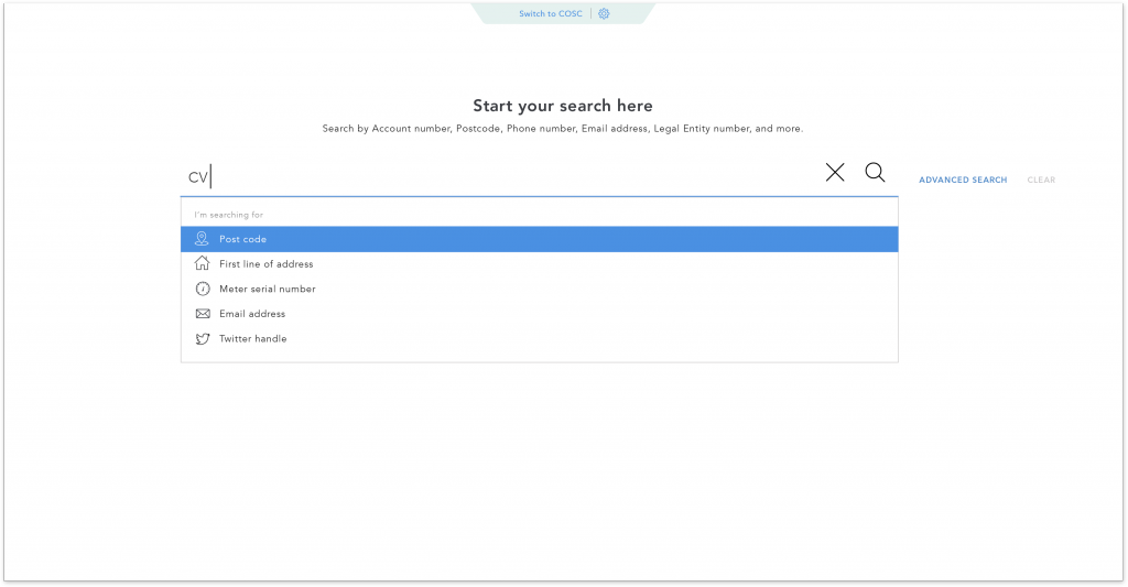
Search landing page
When the user picks up the call from a customer, they need to be able to search for the customer’s detail or information related to the nature of the call. I designed the search screen to be as simple as possible with a list of related search categories based on the input text to help bring up relevant search type promptly.
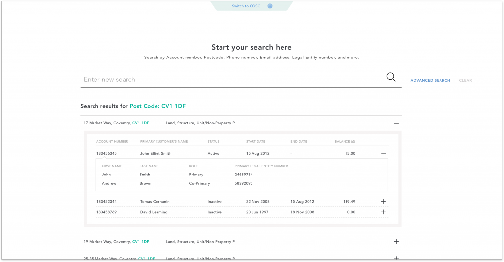
Search results
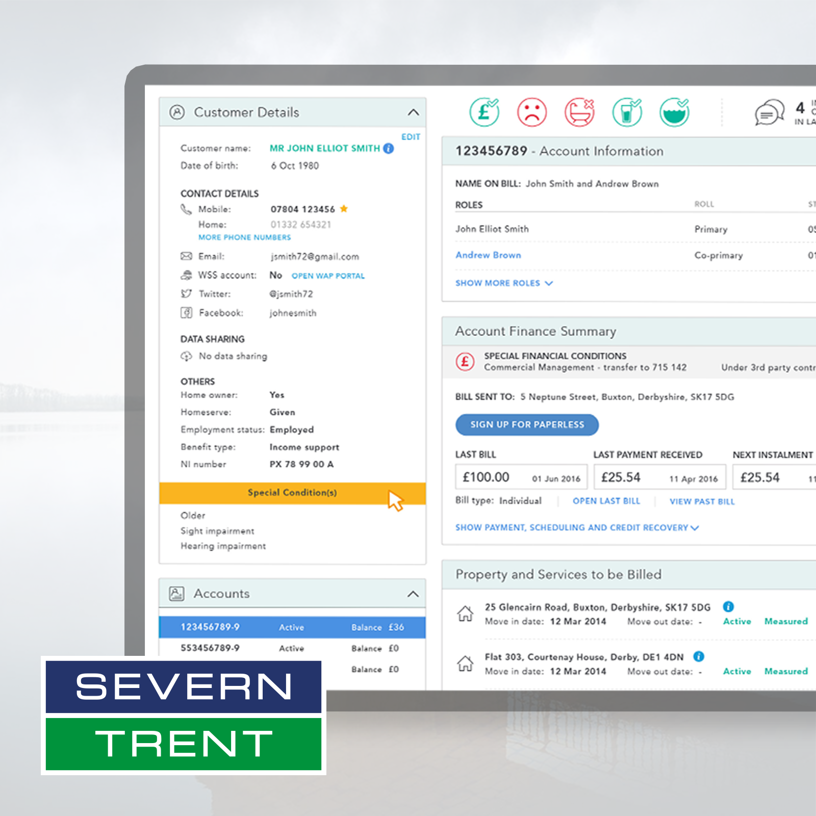
The experience of the users ranges from absolute beginners (new employees) to super users who work across both Billing and Customer service calls (COSC). They all need to be able to retrieve the information they need quickly. For the Billing team, being able to understand the relationship with the customer from the beginning of the call is critical.
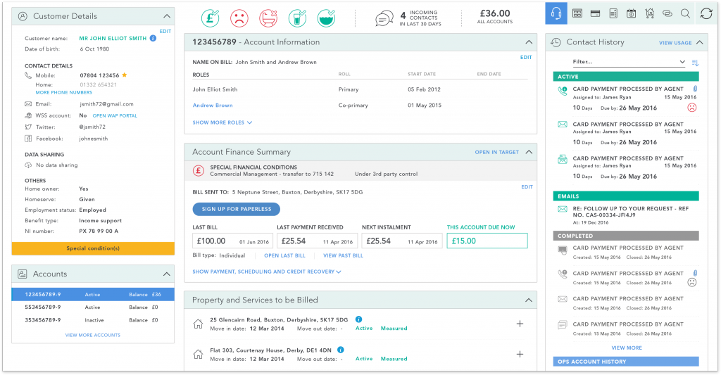
Dashboard for billings - displaying the most commonly required customer information
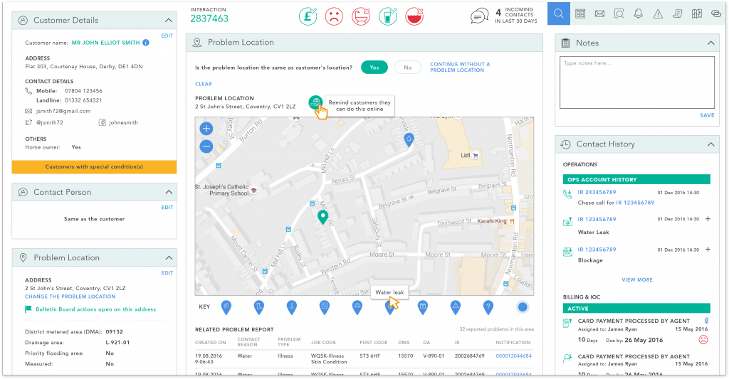 Dashboard for customer service calls
Information is displayed in clearly defined sections of a dashboard; this information is then associated with icons to reduce the time needed to scan for information. As the user will be utilising the system on a daily basis they will quickly become accustomed to the icons relevant to the information they are looking for, tool tips are provided to guide those who may be less familiar with the interface.
Empathy indicators
A set of coloured icons are used to give a quick indication on the customer relationship at a glance e.g. the account status, water supply issues or past contact. This helps to highlight the support that a customer may require. The user is able to see how many times the customer has contacted in the last 30 days or whether have recently had water supply issues. This enables the user to proactively look for the relevant information to assist the customer.
 Billing dashboard header displaying credit status, satisfaction level, supply issue, water quality, sewage/flooding, incoming contacts and total current bill.
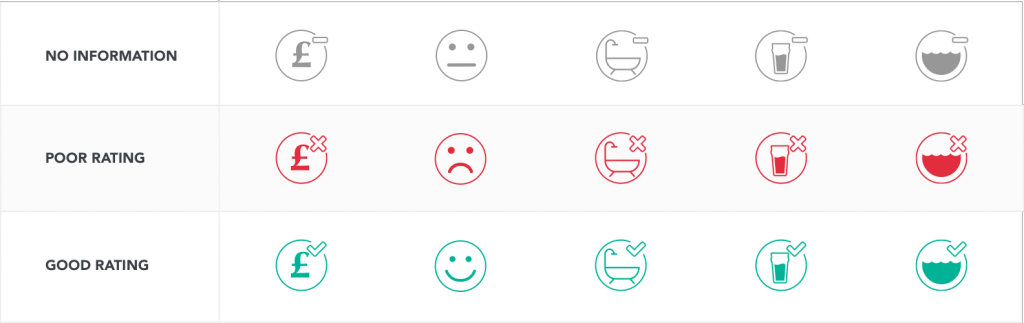 Three different states of the Empathy Indicators
Error management
System errors and water supply issues are displayed at the top of the page to inform the user of any known issues that may be affecting the customers. I chose strong colours to bring attention to these messages. As the system errors only affect a certain part of the database, customers may or may not be affected. I have given the two different types of error different colours - black for technical system errors and red for water supply issues.
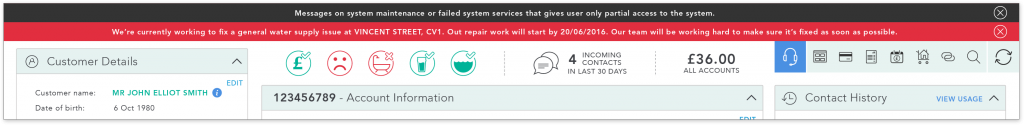
Dashboard showing the two different types of error banners
Colour coded
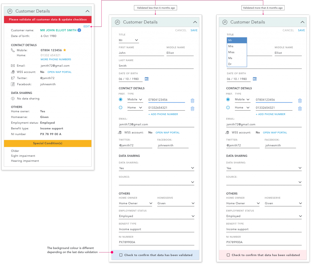
Strong colours are used to bring out important messages, tasks for the user to complete and to highlight important information about the customer. For example, to bring attention to missing information that is required or inform the user of customers with special requirements.
Styleguide
I have created a style guide which consists of colour swatch, font style, component library and spacing. The style guide is shared with the development team. As the development team mainly worked on-site in Coventry and I was based in London, the style guide needed to be as detailed as possible. The developers are also able to use the style guide and the various components that have been designed to create screens that do not require UI input.
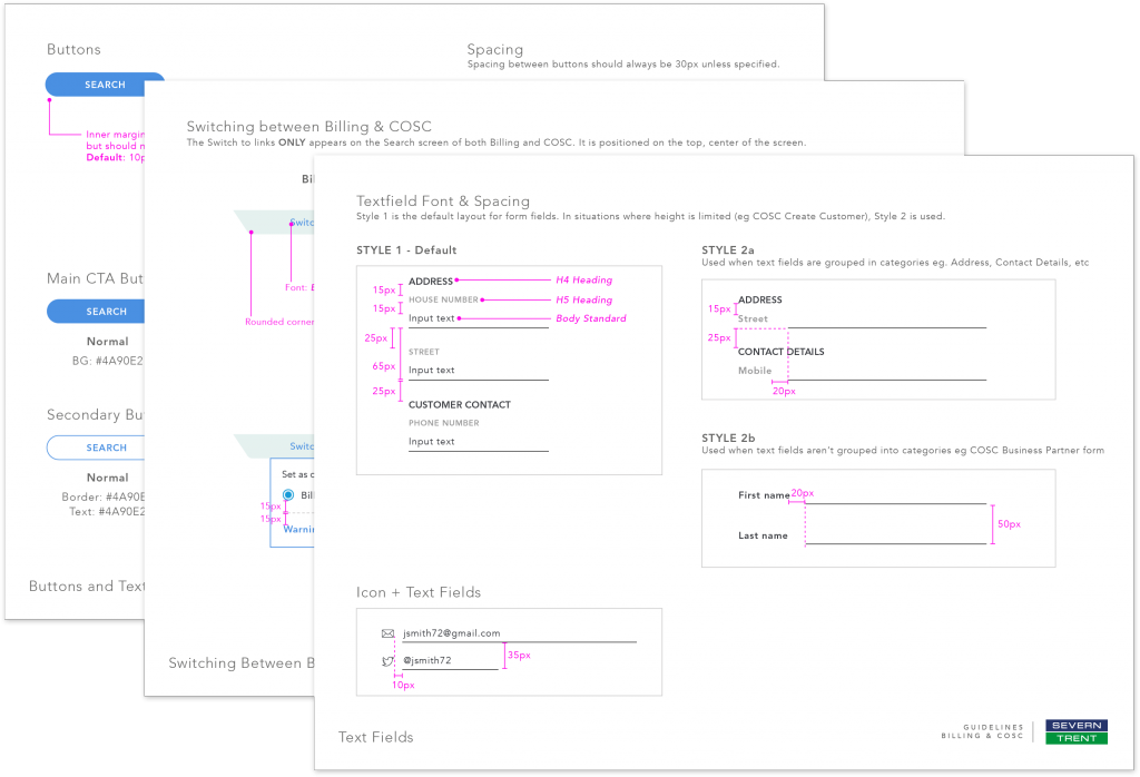
A few pages of the styleguide for the development team
Conclusion
Displaying huge amount of content without cluttering the page was one of the biggest challenge, which I was able to solve by placing groups of information in self-contained panels within the dashboard. The colour choice was important to keep the content easy to find without too many distractions. The final product both sped up the initial training period required for new users and also improved the time taken to respond to customer contact.
With this new system in place, STW is able to move the agents between both billings and operation teams easily without intensive re-training. The dashboard view reduces time spent searching for relevant information and shortens the time users spend per call. The high-fidelity design I created enabled the development team to build a fully working platform. Further iteration to the design can be made with user feedback.
As I was working remotely in the London office, I learnt to keep all communication as detailed as possible and I was then able to utilise the time I spent on-site to gather feedback from end-users and stakeholders and better support the development team.
I have also learnt that whilst the screen setup used in Severn Trent office is the same for every user, some of the users changed the default font size to a larger setting. This was discovered after the product had been built in the testing phase. The style guide that I created will help set a good base for further iteration to the design to cater for adjustable font settings.
For this project, I worked mainly with four UX Designers, the front-end development team, Project Manager and stakeholders to ensure that the UI design met the brief.
No comments.