Debenhans :
Recover Abandon Basket
UX + UI implementation to increase conversion on eCommerce site
As with any online retailers, basket abandonment is a big challenge at Debenhams. I've been tasked to look into how we can target abandon basket. Working alongside Product Owners and the development team, we delivered a solution that saw a £5m revenue uplift.
CLIENT Debenhams
TOOLS Sketch, Miro, Keynote
ROLE UX and UI
What I did
My initial task was to do some research on abandon cart and explore what are our options. Conducting user research would give a greater understanding on issues faced by Debenhams customers but there wasn't any budget for it. So I had to rely on researches conducted by other retailers. It appears the most common reasons for abandoned baskets are:
- unexpected shipping cost
- shopper was conducting research with the intention to buy later
- high product price
- no guest checkout option - some users are put off with the idea of having to create an online account
- long and confusing checkout
- facing technical errors
- delivery options do not meet requirement
Around 75% of cart abandoners return to the site within 30 days and about 47% of second cart abandoners return in 60 days with 1 in 4 cart abandoners making a purchase. The best channel at pushing re-visits is by emails (67%) - with three times more likely to buy and spend around 55% more.
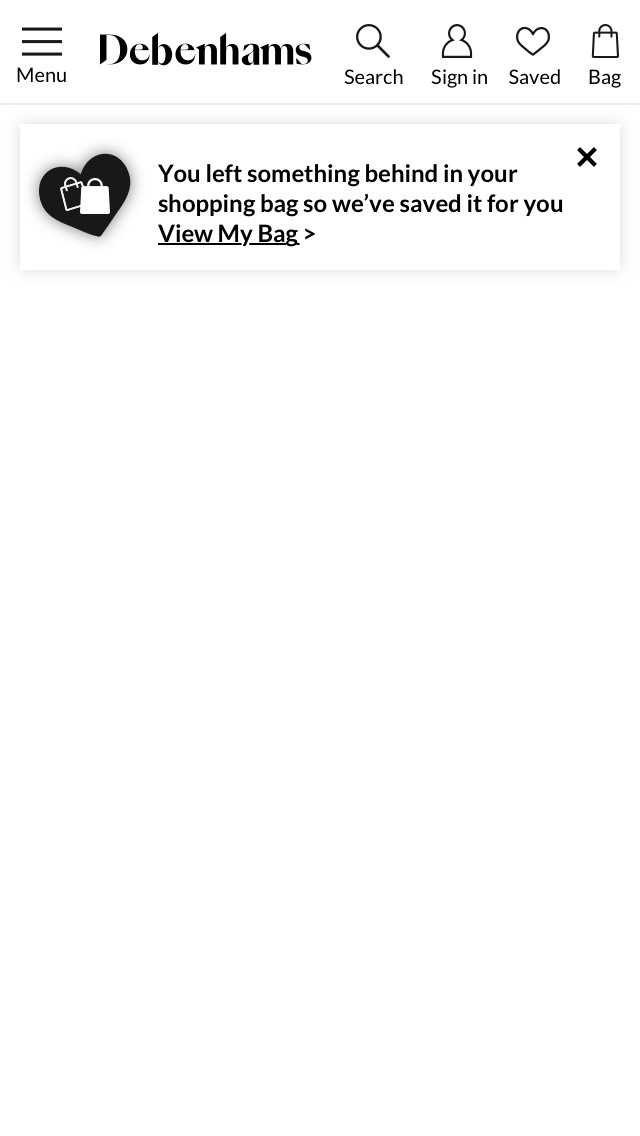
Debenhams already sent out emails to registered customers with abandoned basket but further improvements can be made to the email content.
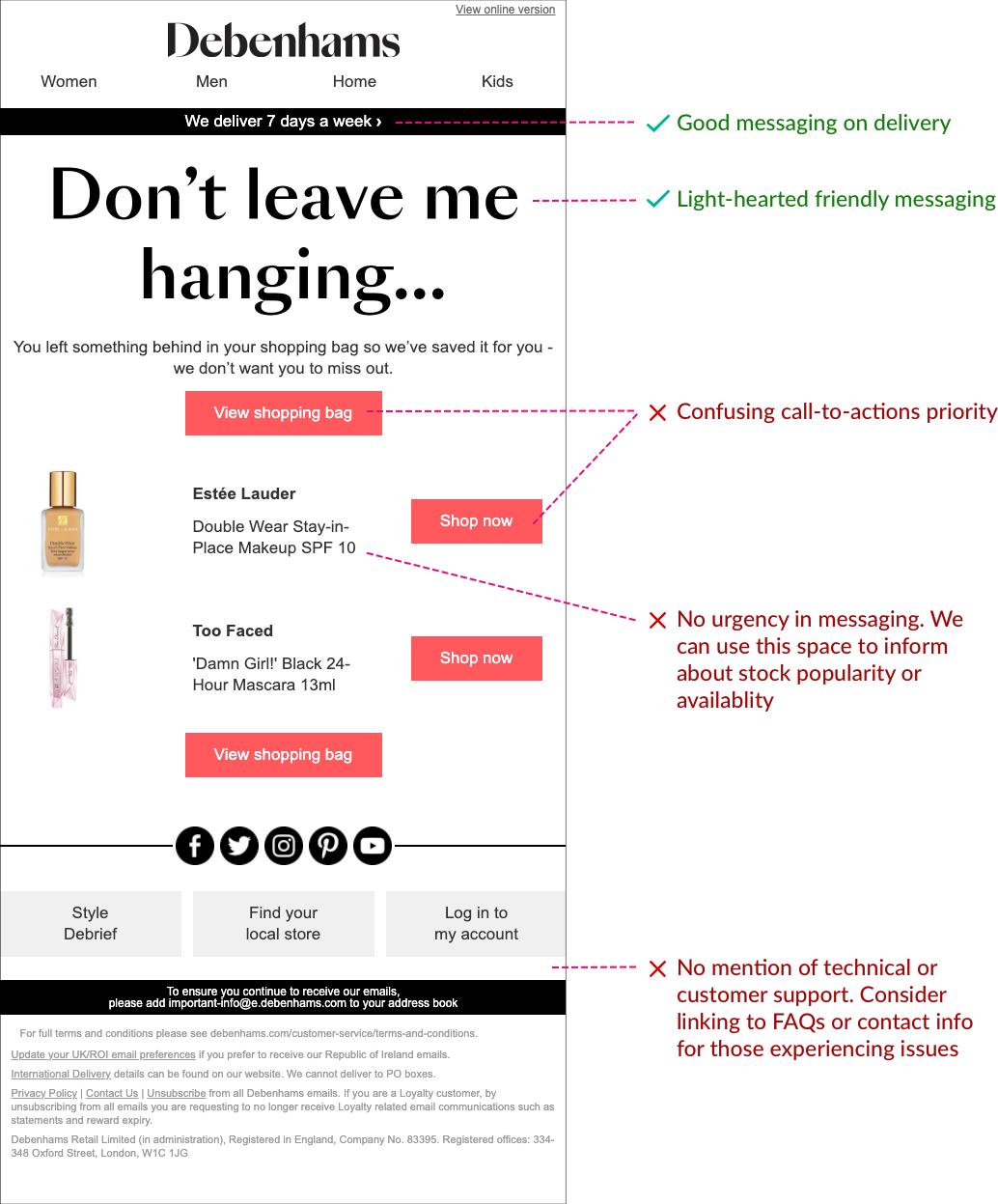
An example of email sent to registered cart abandoners - what we're doing well and some suggestions on how to improve it.
Apart from emails, Push notification is great for direct and instant messaging but Debenhams oline platform no longer supports the feature.
RE-ENGAGEMENT ON SITE
We decided to focus on re-engaging cart abandoners when they return to the site. I began with creating some wireframe variants to present to the stakeholder. As we will be conducting A/B test on the variants, I wanted to find out if providing product information will achieve better result and the effect of the placement of message. I went straight to creating high-fidelity wireframes as I have access to UI component library and would like to reuse existing components.
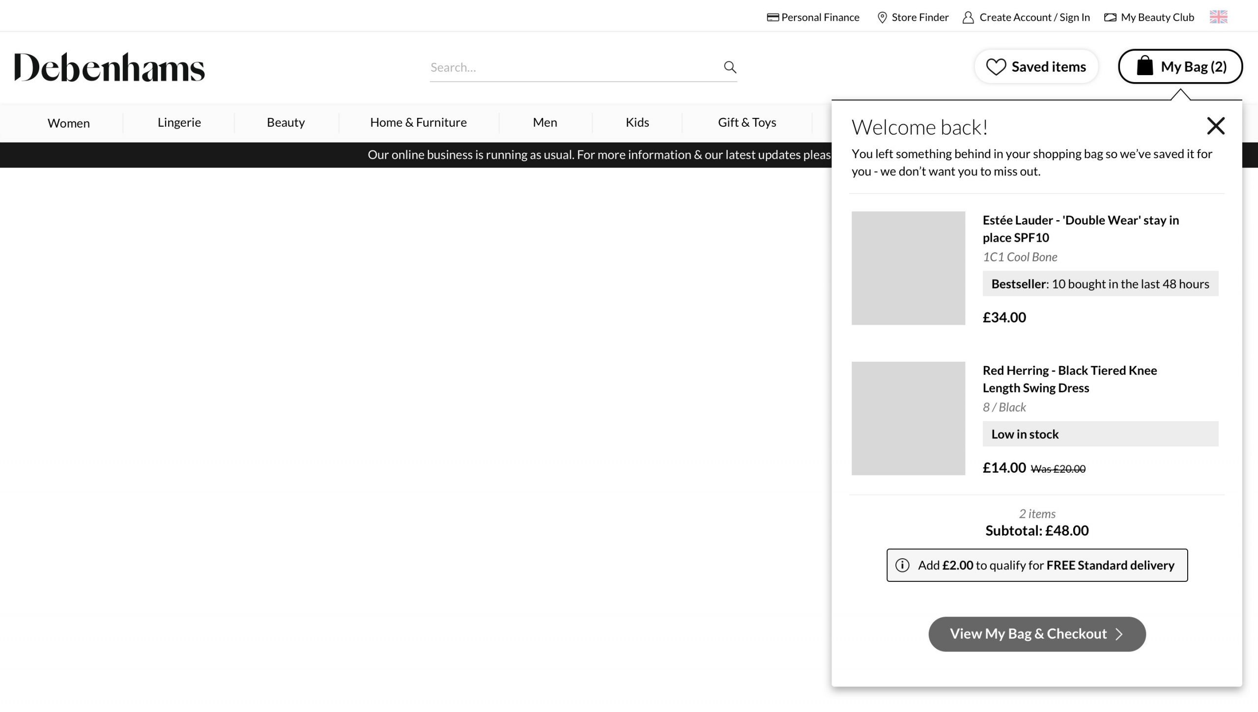
Desktop Variant 1 - an overlay popup that points users to the My Bag button to associate users with Checkout. Using Social Proof like highlighting Bestseller items, information on low in stock items and whether they qualify for free delivery.
Desktop Variant 2 - a less intrusive popup that sits at the bottom of the page that allows the content on the page to still be visible. The use of Social Proof and items low in stock are utilised in this variant.
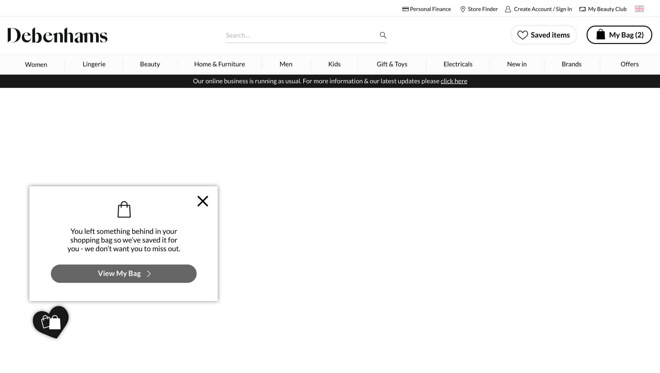
Desktop Variant 3 - re-using an existing component with an icon overlay that opens up a popup linking to My Bag page. This variant will likely not yield a good result but it will require little effort to build.
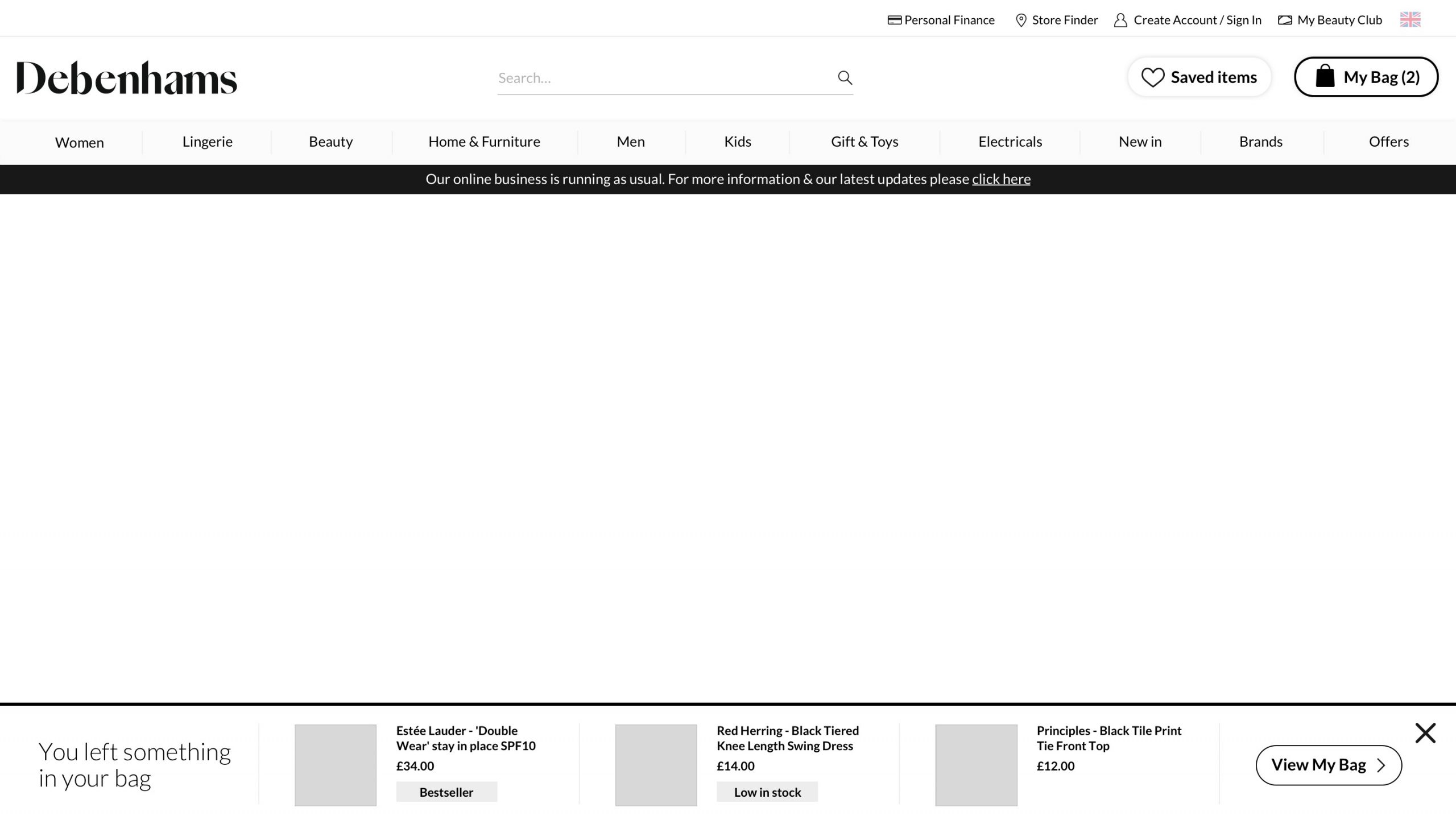
Desktop Variant 4 - top notification banner. A simple low effort approach to re-engage cart abandoners. Message to include delivery option and stock availability to increase engagement level.
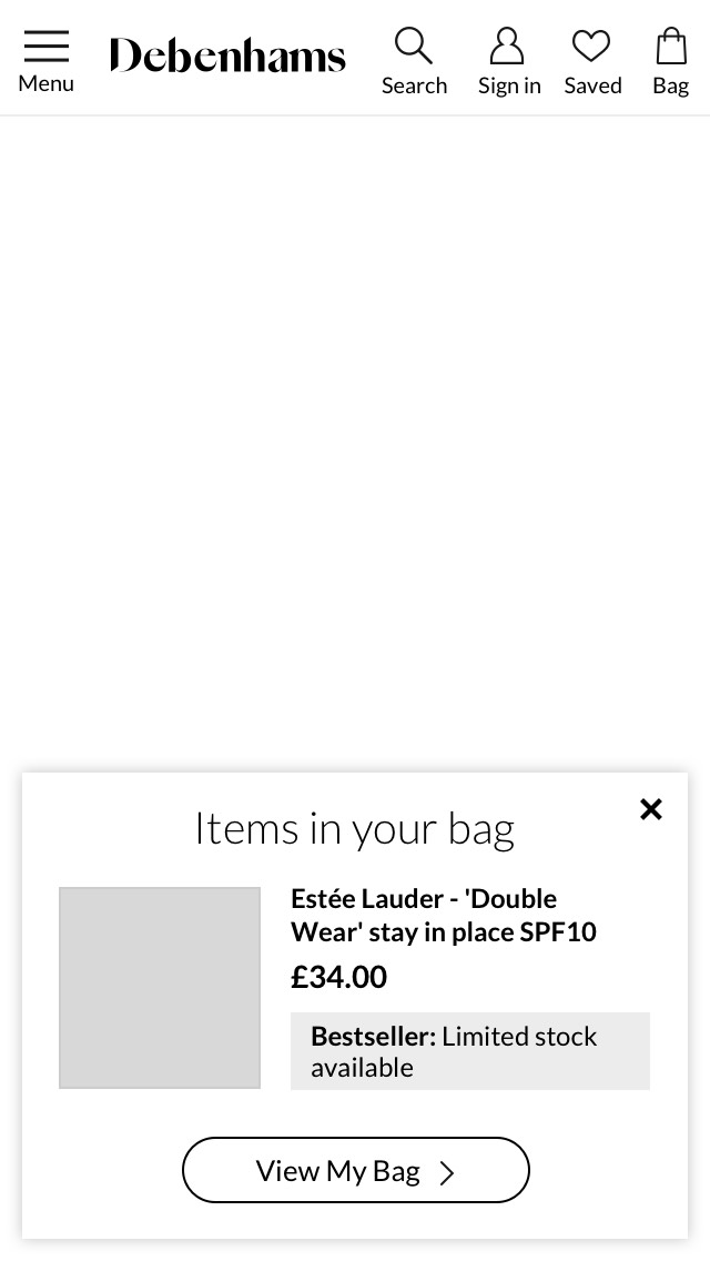
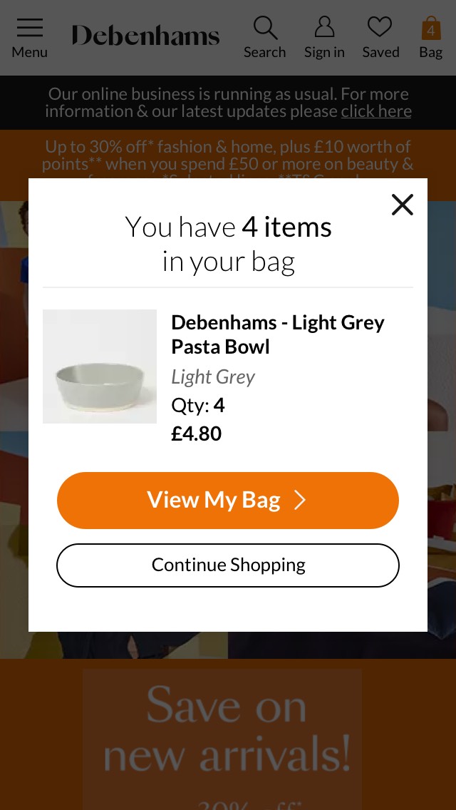
Mobile Variant 1 - popup overlay displaying just the last added item whilst still keeping navigation accessible and page content still partially visible.
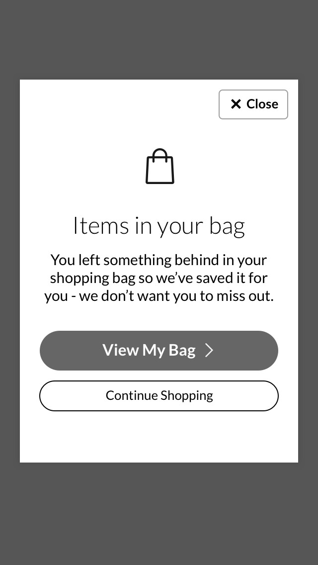
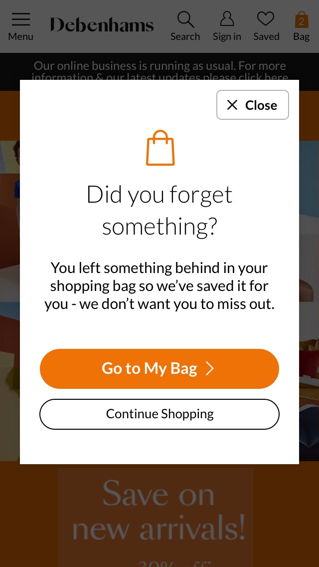
Mobile Variant 2 - modal overlay with generic content to drive traffic to My Bag page.
Mobile Variant 3 - overlay modal with displaying product image and details. Using Social Proof, stock availability and free shipping eligibility to drive conversion.
Mobile Variant 4 - a low effort, less disruptive approach by using generic content directing traffic to My Bag page.
MOBILE FIRST APPROACH
Out of the four mobile wireframes, we have picked Variant 2 and 3 to conduct A/B test. Variant 2 requires less development time and can be rolled out via our testing platform rather than the usual sprint deployment. We used that to test two copy variants - one with a generic header ("Did you forget something?"), and the other with number of items in the shopping bag ("You have X items in your bag"). The result for both were very strong - with the second variant as the winner. This led to the theory that we could see even better results with more product information.
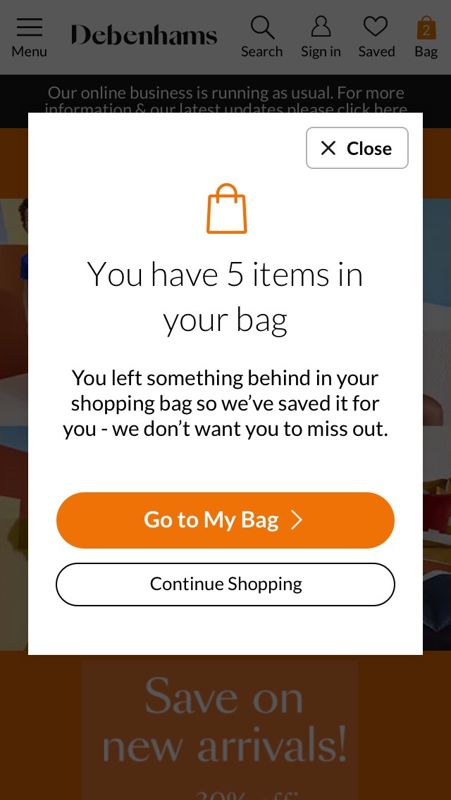
A/B Test 1 - We tested the impact of generic content vs displaying number of items. The result was very positive, generating £150K revenue for both and the clear winner was the variant showing the number of items (above right).
UI ITERATION FOR MOBILE VIEW
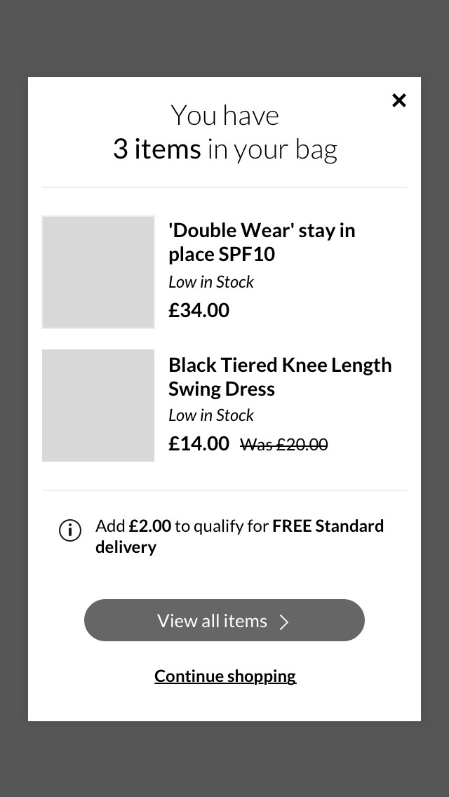
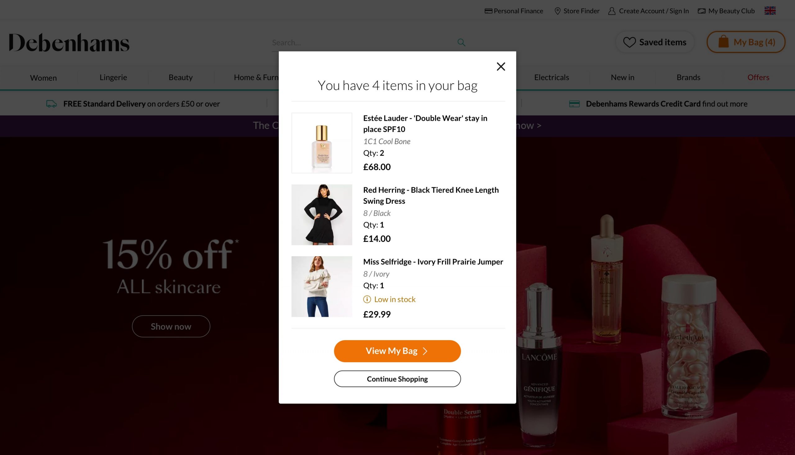
During a session with the development team, we discovered that there were technical constraints around providing Social Proof and stock availablity on the modal. I did some iteration to the design and included designs to cover for all scenarios. Mobile users tend not to scroll so it'll display up to 3 products, showing product image, name, size/colour, quantity and price. I wanted to direct users to My Bag page if they want to review the items they have in My Bag so the content is kept minimal.
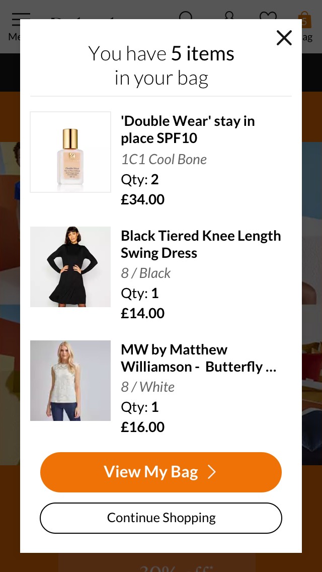
The iterated design for mobile. Up to three products are displayed on the modal which include product image, name, size and/or colour and price. If the cart contains less than three products, the modal will resize its height to fit content (see above right).
I discovered that there has been inconsistency in the CTA wording on our mobile site ("Go to My Bag", and on desktop, it's "View My Bag"). Debenhams' site on the whole, uses "View ..." on CTAs in general so we updated the CTA on mobile to say "View My Bag".
DESKTOP VARIANTS
For the desktop site, I proposed three variants to test engagement level - one to test a full-page modal popup vs a less intrusive top corner popup that points users to the My Bag button and a third variant to test the placement of the popup.
Desktop Variant 1 - replicating the winning variant on mobile by using a full-page modal popup. The purpose of this variant is to encourage users to go to My Bag page where they can perform Checkout.
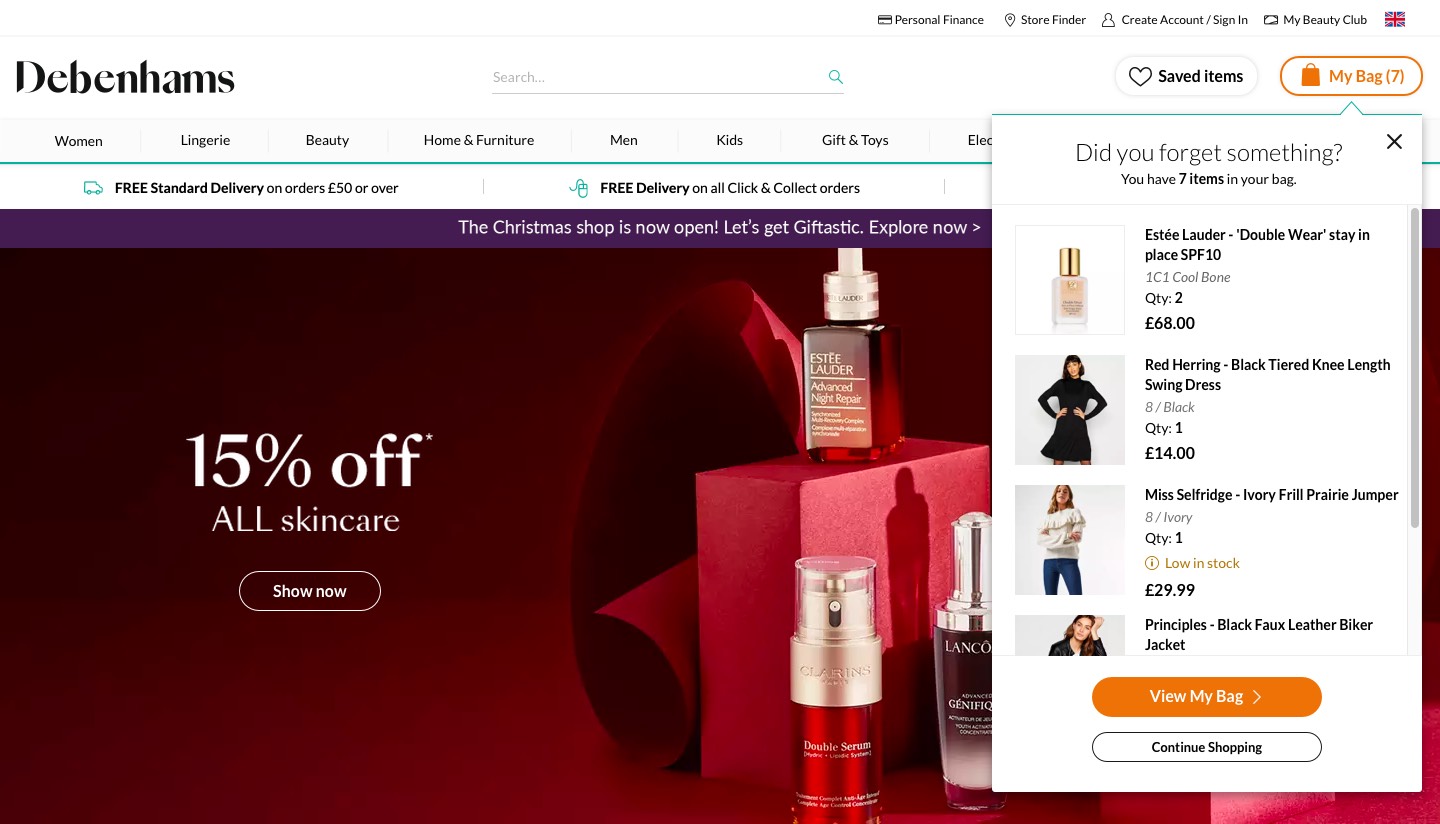
Desktop Variant 2 - a top corner pop-up pointing to My Bag CTA. It will display up to 7 products, using a scroller and the last visible image half showing on screen.
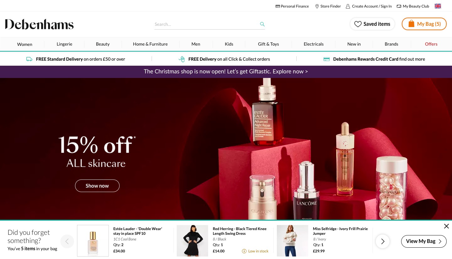
Desktop Variant 3 - a less intrusive approach that allows users to interact with the main navigation or see the content on the page without needing to close the popup first.
As the project was going through final round of development QA, Debenhams announced that its going into liquidation which meant that all enhancement projects were on-hold. We did however managed to get a simplified desktop popup on site and the result wasn't as strong as on mobile but still positive. We saw a £4.9m revenue uplift on all the variants.
Conclusion
We weren’t able to conduct user research due to business constraint but luckily there are plenty of materials online conducted by other online retailers that I can refer to and get a general overview on customer behaviour. It's interesting that we achieved stronger results through our mobile site than on desktop as we normally generate more revenue through desktop. It would be insightful to see if showing product information would make a difference to users behaviour. Despite not being able to test the iterated design, we achieved revenue uplift of £4.9m on the simplified mobile and desktop variants.
TEAM MEMBERS
Product Owners - Melanie Wasley, Patrick Say
Frontend Developer - Cameron Wortlehock
QA Tester - Vishal Malhotra
Analytics - Todd Coughlan