Condé Nast
Improve shopping experience on Product Listing Pages
Scope of work
UI & UX Design System Scaling for multiple brands
Problem Statement
Majority of commerce conversions come from Product Listing Pages (PLP) but the existing page template (designed for article content) isn’t ideal for PLP usage. Below are some of the problems to solve:
- how might we improve first impression
- reduce bounce off rate
- increase click through rate
- PLP lacks editorial influence
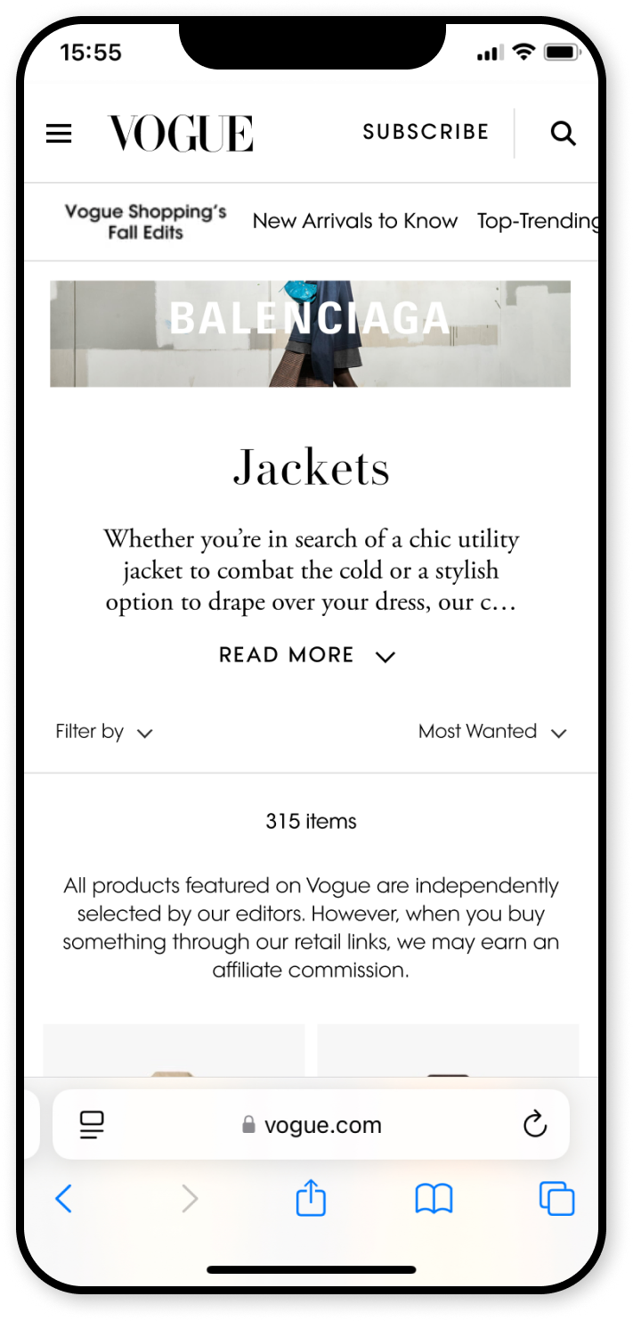
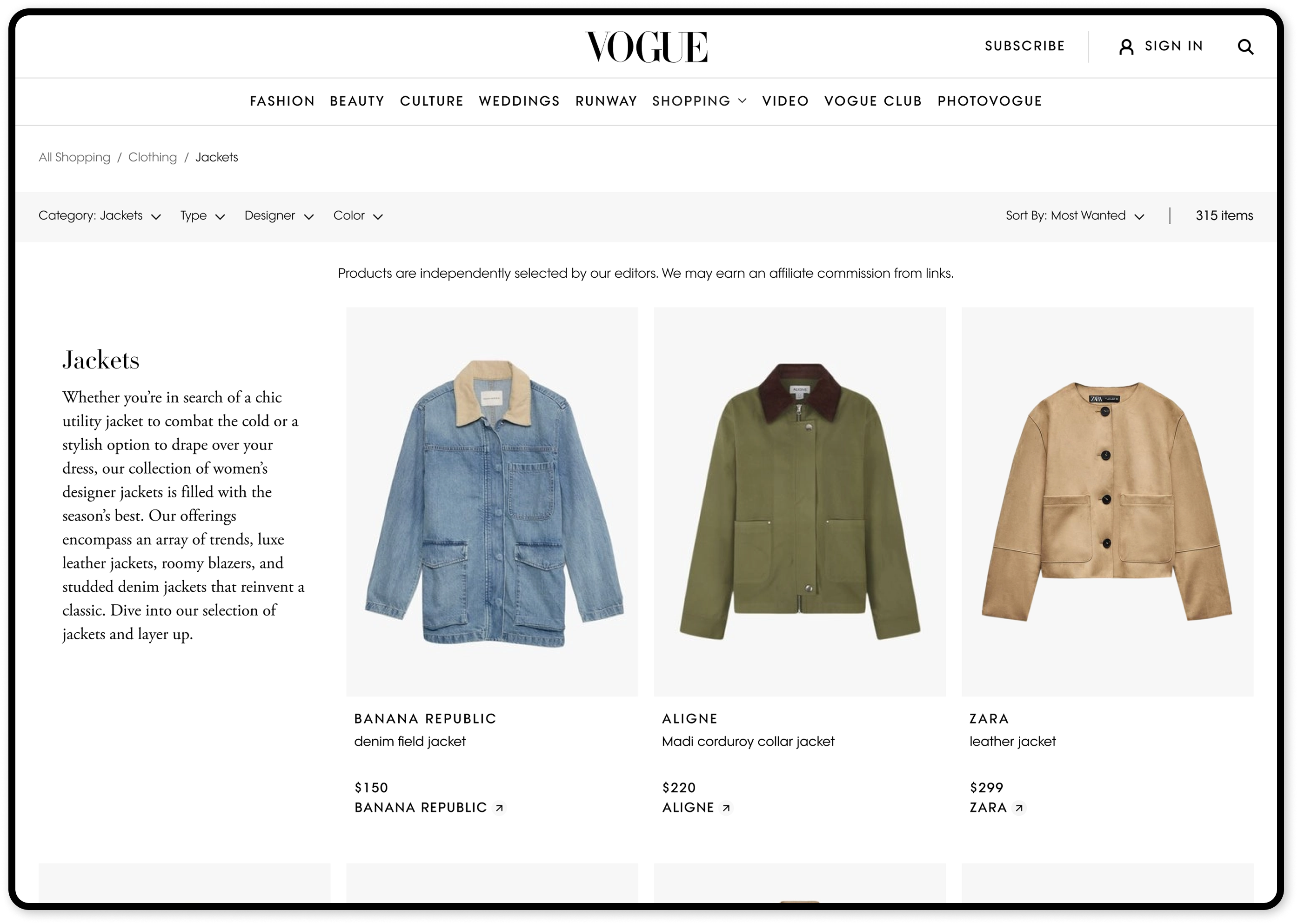
BEFORE
The products are not in view when user first landed on the product listing page
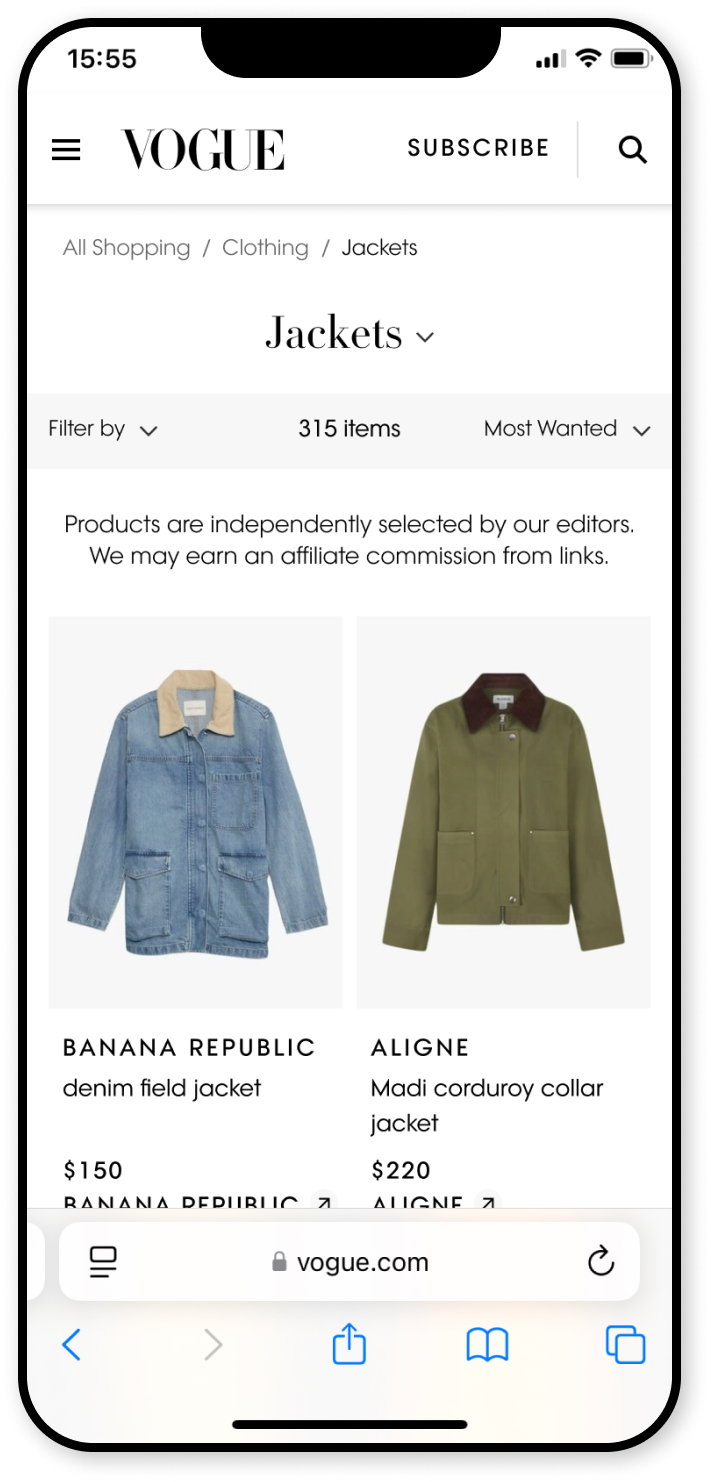
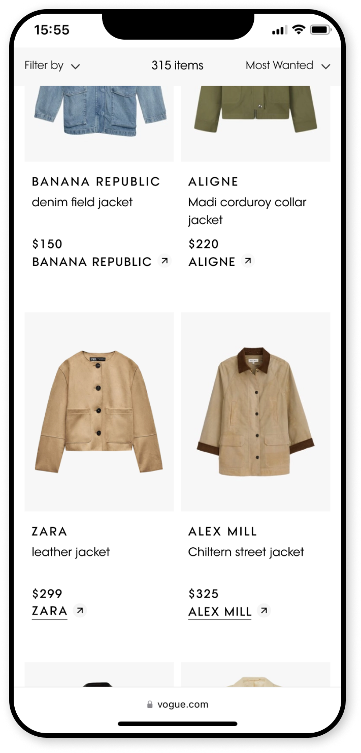
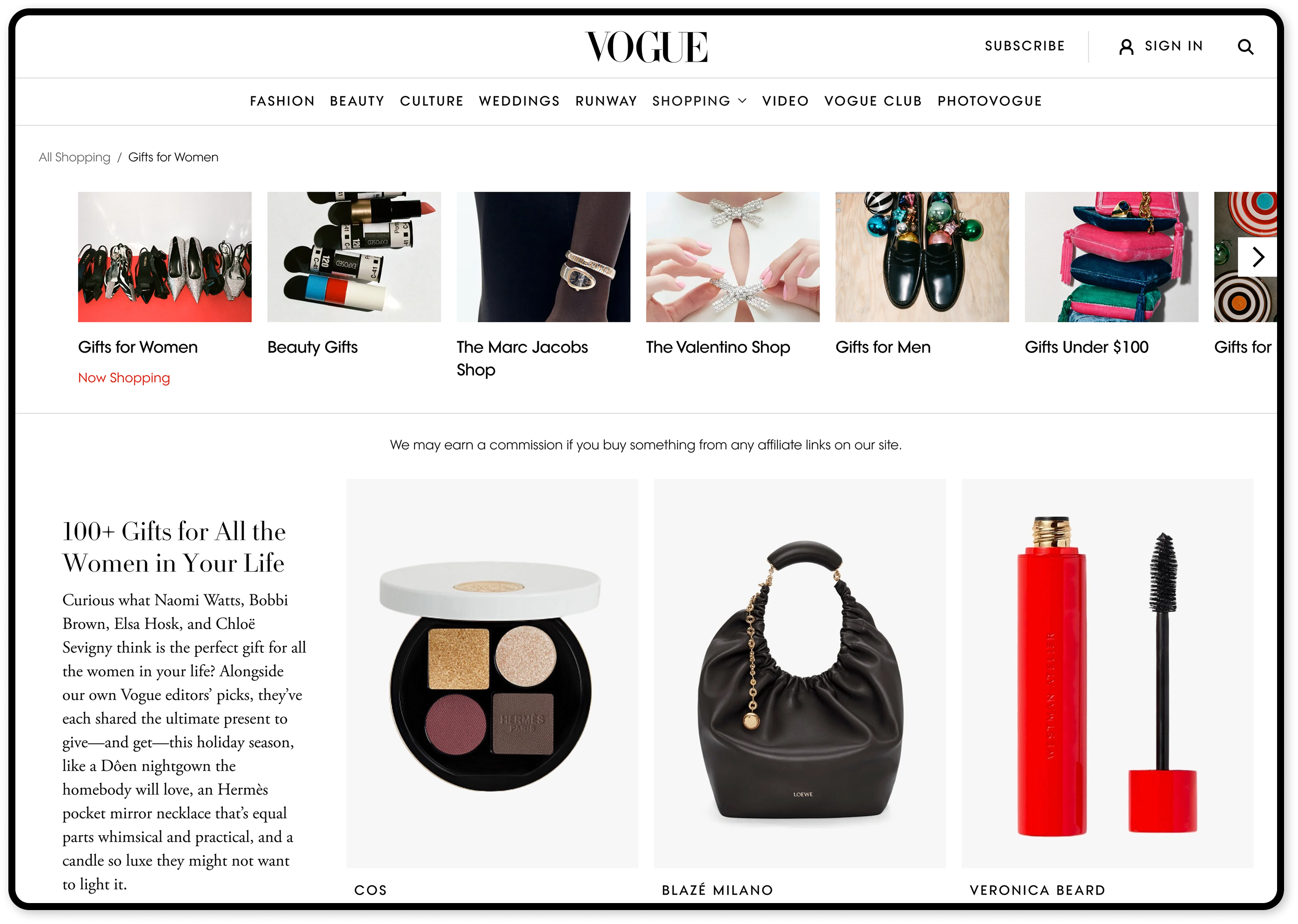
AFTER
Improve first impression by removing advertising banner and reducing the height of the page header content. We increased click through rates dy making the Filter and Sort bar sticky to improve product search.
Improved first impression
On desktop, page header and introduction content is moved into the product grid to improve product visibility, so our users can get straight into our content
Recirculation carousel on Editorial PLP
By making more of our content more visible and easily accessible, we reduced bounce rate on our PLPs. We've also increased our commerical partnership directly with retailers by showcasing paid-for PLP collections on the recirculation carousel
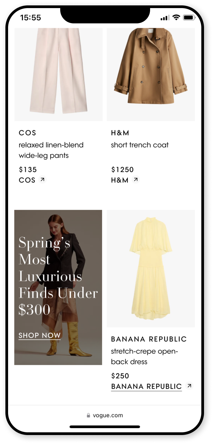
Reduce bounce rate on PLP with recirculation unit midway through the page
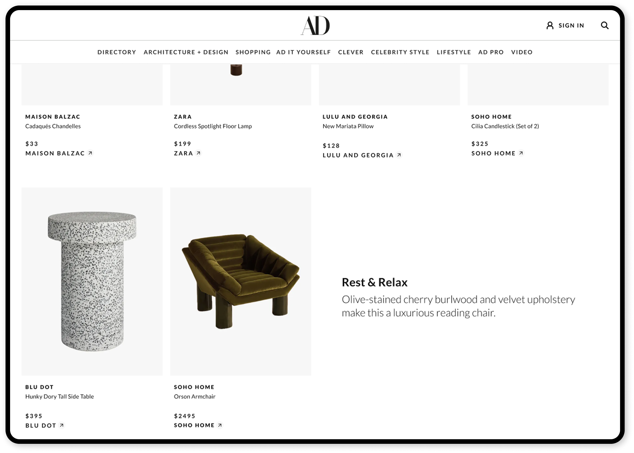
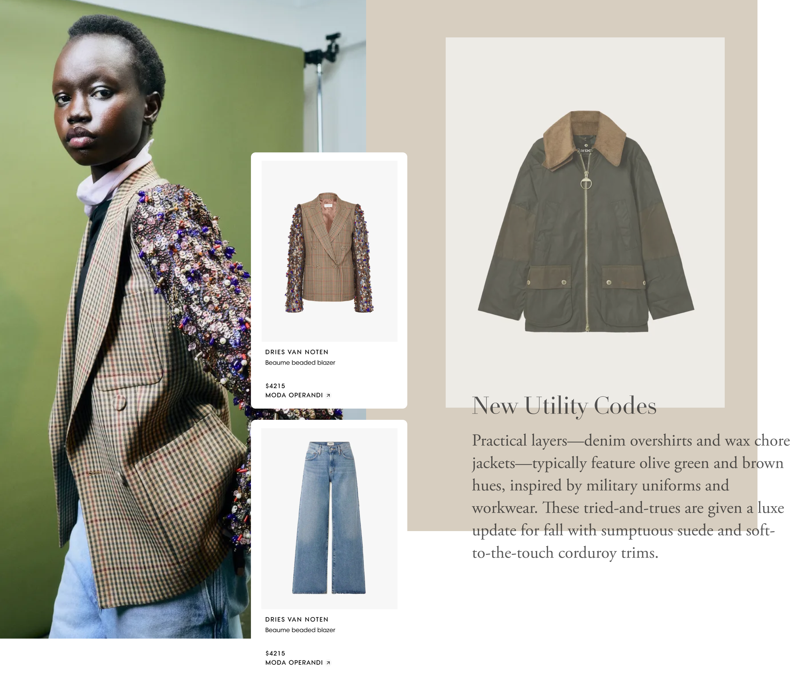
Editorial recommendation
A text-based component allowing editors to highlight hero products, reinforcing our strength as an editorial-driven brand

Driving newsletter signups
Since most commerce traffic comes from newsletters, increasing signups directly boosts traffic to commerce content
I led the design for the Product Listing Page (PLP) improvements, working closely with the Project Manager to prioritise key enhancements. Despite some proposals being put in the backlog due to limited engineering resources, the implemented changes improved user navigation and made commerce product easier to discovery.
© 2025 CRISTY BALL. ALL RIGHTS RESERVED. CRISTYBALL@GMAIL.COM LINKEDIN