Penhaligon's :
Product Detail Page (PDP) Redesign
Improve engagement and conversion rates through the integration of visually captivating content
TOOL Figma
ROLE Research and UI
Since 1870, Penhaligon's has created luxurious and timeless fragrances that embody elegance. With a wide range of scents and bath, body, and home fragrances, Penhaligon's captures the essence of traditional British perfumery. Their in-store experience invite customers to explore and find the perfect fragrance to suit their style and personality. In contrast, the online experience fell notably short in comparison.
What is the objective?
- Enhance user experience - making it easier to find product information (how does it smell, what's the story behind the scent)
- Increase time spent on site - increase customer engagment with the brand and products, build brand loyalty
Existing Product Detail Page (PDP) - lacks information about the scent ingredients and the rich storytelling element that is core to Penhaligon's branding.
Research Phase
I was not able to conduct user interviews due to budget constraints but there were enough customer facing staff I could interview to get a general sense of what users are looking for when they are shopping for fragrances. At Penhaligon's there is a team of in-house fragrance educator who are responsible for training retail staff on the product range, and they regularly host live virtual events direct to consumers. Through them, I was able to find out:
- about the storytelling approach Penhaligon's use to help customer identify the scent they love
- the language used to describe the scent
- how imageries play a big part in conveying the scent story
I found out from some of the Store Managers that Penhaligon's has a number of core customer type and they have quite different considerations when making a purchase. As the brand has such a strong history, I was also able to find comments from social media fan groups which helped me identify the recurring questions and pain points from several users.
I also did a competitor analysis on what other fragrance brands are doing as well as brands with similar challenges in selling products online ie. paint, beauty and eyewear industries.
The interaction data on existing PDPs shows that majority of the interaction (average around 26%) are on the image carousel, followed by "Add to Bag" button (between 1.5% to 22%, higher convertion rate seen only on signature scent). Traffic is slightly higher on desktop whilst convertion rate is higher on mobile. My assumption is that users are looking for information about the product and purchases are mostly either repeat purchase or have previously tried the product.
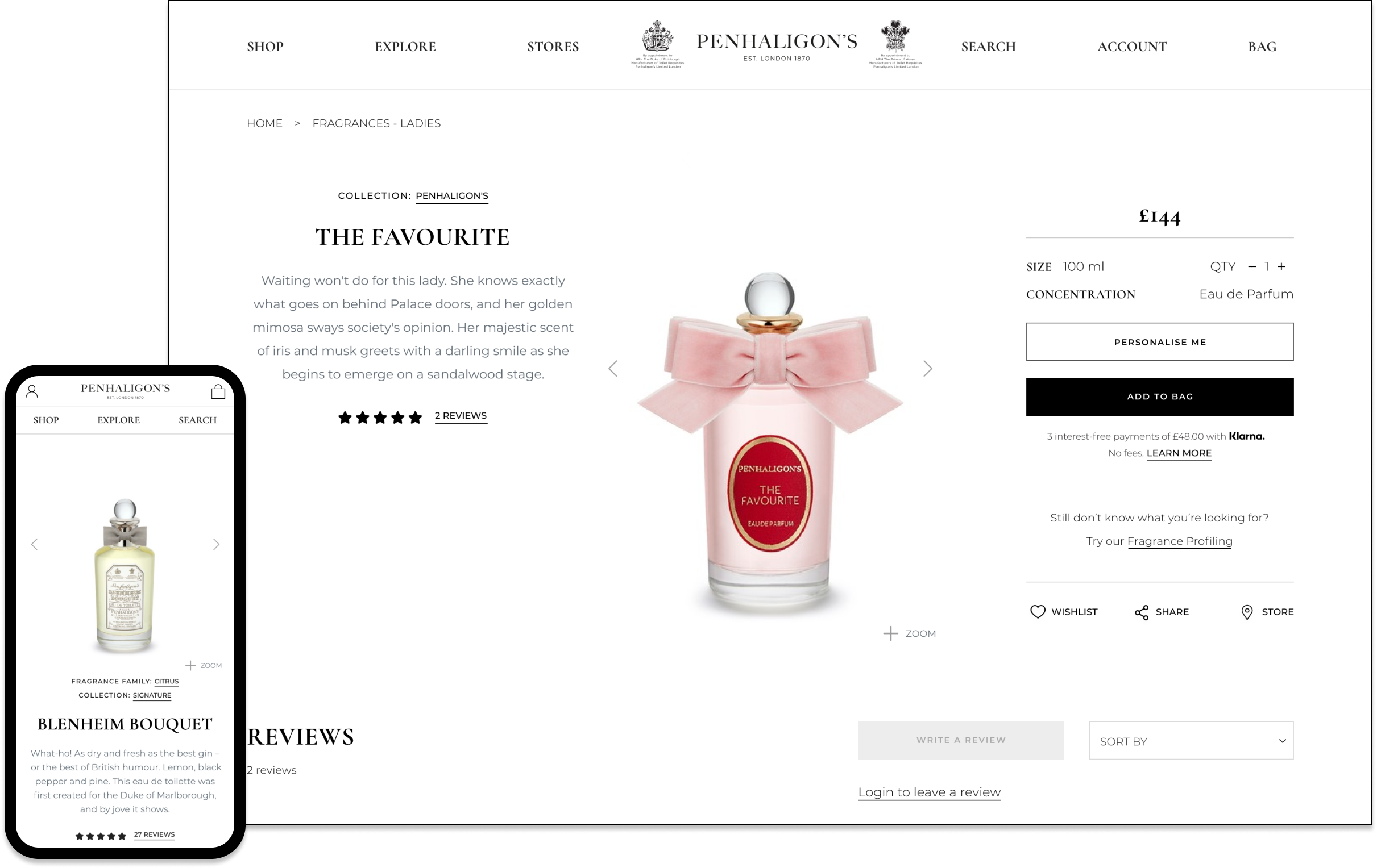
The Design
Desktop View
During Phase 1, the main navigation and breadcrumb will remain unchanged.
Content on the left are reserved for imageries and videos whilst the right hand side holds product information and call-to-actions which sticks to the page whilst user scrolls.
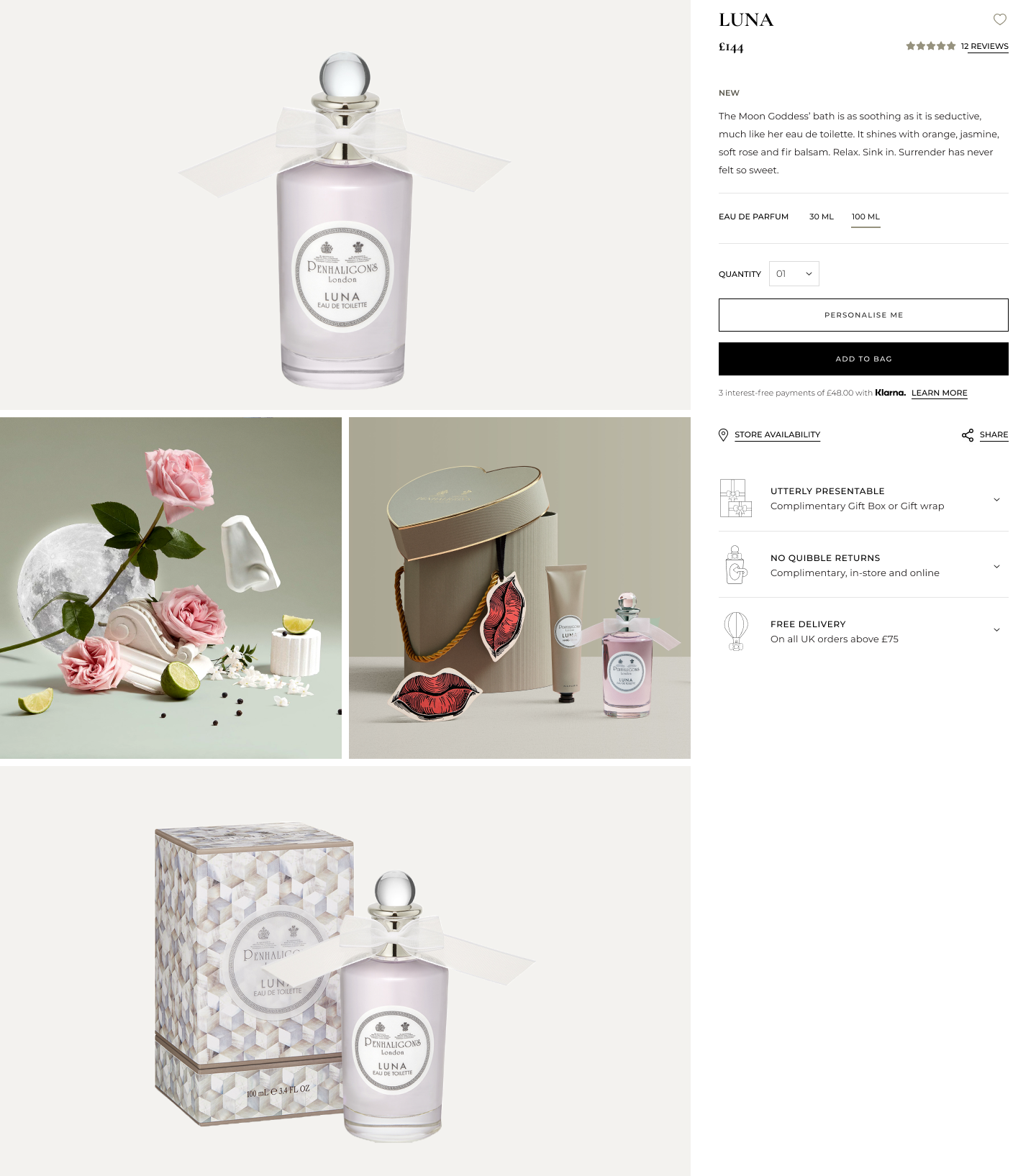
Choice of imageries
Top row: Display the product itself against a transparent background. This allows us to apply the brand color behind the product image on this page whilst retaining the ability to reuse the image on Product Listing Pages.
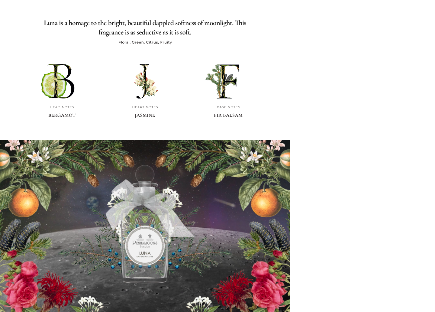
Second row, left: Scent-related imagery to capture the brand's eccentric and creative heritage whilst giving users a sense of the fragance story.
Second row, right: Utilise gifting-themed imagery to highlight the product as a suitable option for users seeking gift ideas.
Third row: The packaging inclusion highlights the brand's rich storytelling heritage, with one of the signature product range (The Portraits) featuring collaborations with renowned illustrator Kristjana S. Williams, making them highly sought-after among fragrance collectors.
I partnered with Penhaligon's Head of Education to create consumer-friendly content that was previously only available internally, aiming to provide customers with a deeper understanding of the scents.
Additionally, collaborating with Penhaligon's Creative team to visually depict the ingredients, aiming to aid users unfamiliar with them and provide a scent indication through visuals.
The video content is placed at the bottom left, inspired by the brand's social media and new launch campaigns, aiming to integrate their rich interactive storytelling element into the product detail pages (PDPs).
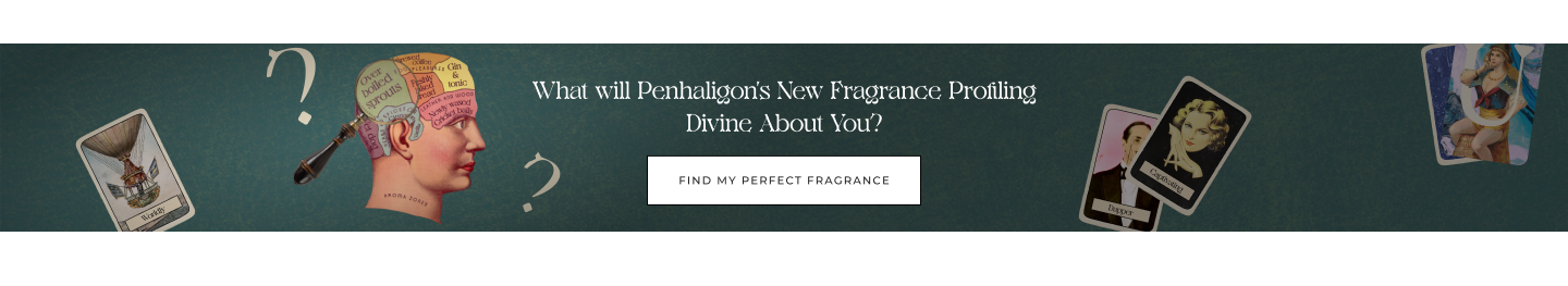
Underneath the product details, I positioned the Fragrance Profiling banner to guide users to the fragrance finder quiz, particularly for those who remain unsure about their scent preferences.
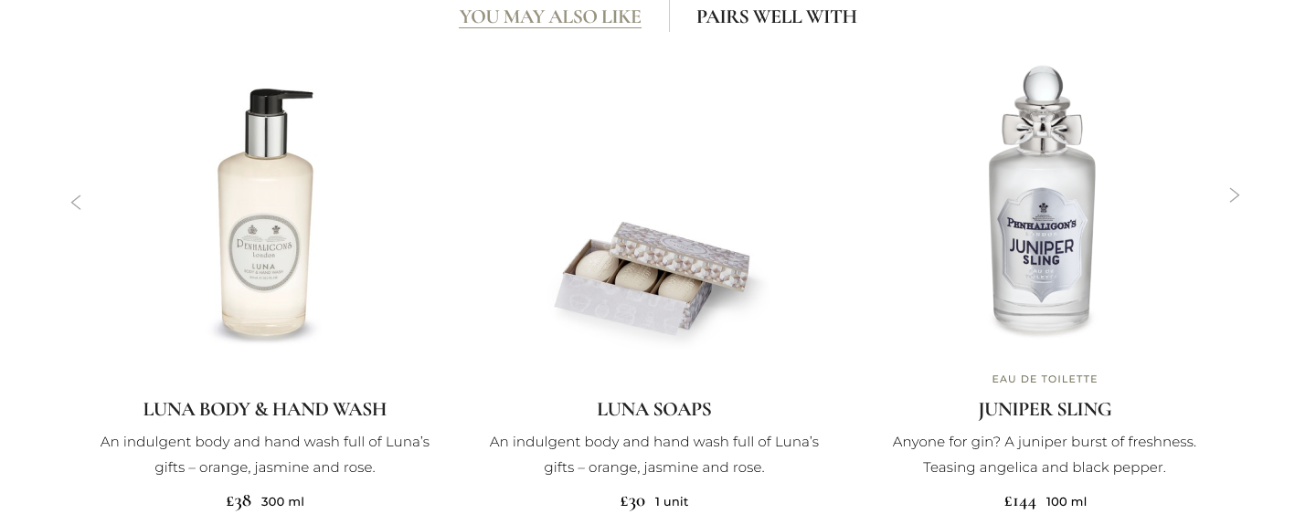
In addition to typical alternative product recommendations, I've added a "Pairs Well With" cross-sell suggestion. This was inspired by customers seeking complementary products in-store to enhance or blend their individual scents.
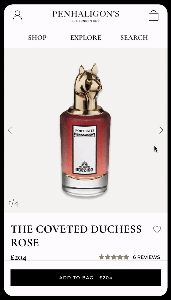
Mobile view
The "Add to Bag" button remains persistent at the bottom of the page if the in-page button isn't visible.
Given the brief nature of mobile visits, the page prioritizes low scroll depth and reorders content by importance to swiftly deliver information.
Conclusion
Within the first week of launch, we saw users’ time-spent on product pages increased by +15% and bounce rate reduced by -12%.